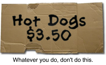
Rule #1 – Don’t Be Scary. If you are using home made signs, they had better be good. Nothing suggests a risky meal more than a hand lettered cardboard sign. It might as well read, “Food Poisoning? Maybe.” On the other hand, professional signs make your operation look neat and clean – and that is what the customer wants to see.
If you absolutely can’t afford professionally made signs, you could go with a black chalkboard and colored chalk lettering. People are used to seeing these in the waiting area of trusted restaurants which makes it an acceptable alternative.
Rule #2 – Don’t Be Invisible. Your signage plays an important role in the sales process. The first step in making a sale is getting attention. If they don’t see you, they can’t buy from you. Often times your signage is the second thing they see, right after your umbrella, so make it big and make it bright. Pull them across the parking lot by their eyeballs.
Rule #3 – Don’t Be Difficult. My dad used to tell me, “Steve, don’t try to cram 10 pounds of &#%! in a 5 pound bag.” The same goes for your signage. If your menu looks like a novel, the customer will stop reading. Literally. It’s been psychologically proven that when a person is confronted with too many choices they choose nothing. They walk away. If your signs are simple and uncluttered the customer will be able to quickly decide what they want and that is when you make money.
I hope you find these tips useful. If your signage needs sprucing up, now is the time to do it.
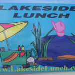
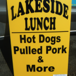
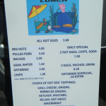
HDCN regular contributor Robin Delancy sent me these pics of her new hot dog cart signage. I really like how they turned out (see pics below).
All right slingers, how about sharing your tips for signs that sell more hot dogs. Let’s hear it in the comments.
-Steve
Click the pictures below for a larger image.


Signage and branding… got it! How about dress code?
Steve
I have been in the sign business for over 20 years. I firmly believe in the KISS method for signs. Keep It Simple Stupid.
You can not put a Bill Board on a Match Box cover.
WOW! That was a surprise to wake up to. Thanks, Steve.
Just for the record, I DO see people taking long and second looks at the new signs, and they usually come back for lunch.
I agree that a professional sign is the way to go, getting attention has been easy for me, being the best looking hotdog guy in Georgia and maybe the world…. See just like a good sign I got your attention…. People come to my cart and say I heard that you have the best hotdogs in town. It took me three years to get a good following. I started out with real professional signs (first signs cost was $100), first menu was printed on my color printer. Now I use Vista Print for all my signs and banners. Business cards, Punch cards and tee shirts. I have also found that getting on TV and in the local paper has not hurt my sales. Advertising works so much better when it is free or real cheap but it must look professional…
Michael
Duggs Doggs
Good!! Good!!
In my readings of sales I read you only have 5-7 seconds to catch a persons interest at food type events. With that in mind I used 2inch high letters from Staples on a lite brown colored board for my prices. You can read it from 35/40 feet away. I see so many sellers at the larger trailers,etc. with prices you cannot read till you are at the window. When I need name/ product signage I had some made up for my cart for 45.00 readable from 80/90 feet away. I use spring clips to hold on the umbrella. Looks great. Reminder if you get an all weather sign (like canvas) make sure to roll not fold up lasts a lot longer. Season opening soon.
Signs can make you or break you, agree with everything you stated, I use very colorful signs, in several different fonts that list all the items we sell. When you are on the street with several other vendors customers need to see what you have available so they can decide quickly.
Ron,
I think the dress code follows closely rules #1 and #2. Don’t be scary, and don’t be invisible.
“You can not put a Bill Board on a Match Box cover.” – Nice, Jimmy!
I wish I had said that.
Robin is not scary, and with that pink cowboy hat she definitely isn’t invisible. Thanks again for the pics Robin!
Michael,
I was the best looking oatmeal guy in my kitchen this morning…
Great tips, Good!! Good!!
Dogs,
Readability from a distance is something a lot of beginners don’t think about. VERY important. Thanks for bringing that up!
Curtis,
Right on, slinger bro! Don’t make them work too hard to figure out what you have.
OHHH, I forgot to mention, Steve; new this year, pink shorts and matching T with name, website and business. DEFINITELY, NOT INVISIBLE! But maybe a little scary.
Pink shorts – WOW! Maybe I’ll try that. I’m slingin’ at a big Easter Egg Hunt on the 31st and pink would be appropriate, right?
Thanks Steve, more words of wisdom. Happy Dogging and “sell em all!”
Wow, Robin these look great. I really like the feminine touch on your signs. Did you do this yourself or someone else? If it is someone else could you supply their information. Thanks.
3′ x 8′ sign $23 off the internet
Frank – what site was that with the $23 signs?
Thanks Mike! Happy doggin’ to you too!
Ditto Max.
as a newbie, I have to thank you , I have been so busy trying to finish up my cart , I forgot about signagage
NICK
Really nice signs ! AND, great new website Lakeside!!! Inspiring!
Great article Steve! I have seen a ton of those handmade signs and it truly is reflective of the operation. Great topic and glad you discussed it!
Another stellar job Steve.
Matt
Thanks Matt. You’re right, it really makes a big difference in the customer’s perception of your operation.
Uncle Frank,
Robin built that website herself and did a great job. She’s a member of my NewOps Group, learning marketing and entreprenuership. As you can see, she’s getting straight As.
Nick,
Send pics of your rig, I’d love to see it!
Hey Robin,
Great signs! I’ve taken a few pointers from them because right now, I’m feeling my dry erase board is insufficient. YIKES! Glad I only used it once so far!
🙂
Dry erase boards can be good, as long as you are artistic. WAY better than cardboard.
Signage, cleanliness and attire are what attract me to a cart/food truck. The quality keeps me coming back.
Yep.
Carefull with your color choices though guys. I, like many other men, more than you may think, are color blind. Primarily Red/Green and these colors when used with each other, just run together and blur to the point of unreadability. Do a little research on color blindness 1st. Hope this helps.
Awesome tip Sarge!
I’m working with a local graphic arts school. One of the instructors is hooking me up with a student who wants some real world experience. I’m paying lower rates than I would to hire an artist, and the student gets something to put in the portfolio.
That’s a great way to get some really good work for cheap. Some of these kids are incredibly talented. Thanks Gordon!
Michael-Duggs Doggs, hey fellow Ga boy where might you be in Ga. I’m in Coweta Co. Just getting started and would like to meet others in my state.
Vic
@Max, I did the menu board myself. Staples did the logo signs for the car and I had a graphics artist do the road signs and t-shirts (Shirts not shown…yet.) If you’re in CT, the graphic artist is a great guy who does a great job at very low prices. He is in Harwinton, right on the main drag.
@Julia, I use dry erase boards for special announcements; upcoming days off, special menu items, new items, etc.
@Uncle Frank,
I did the website for Lakeside myself. As Steve mentioned, I’m a member of the newops group that Steve came up with. It’s a lesson sent from Heaven! You can do a website yourself and maintain the whole thing for under $7 a month!!!
More to come, just do it.
For my weener wagon I have A small Coca cola sign for advertising Any suggestions where to buy more of them?
Steve, my sign philosophy is simple I try to follow the four B theory; big, bold, bright and beautiful. Follow these guidelines and your signs should be successful
Thanks Robin. He is less then a day trip from me and I really like the style so it will be worth the trip. I would like to stop by and see you and have a dog or two.
@Max, Would love to meet you! You know how to get there? The website should tell you WHERE I am. Can you GPS it? I’m off tomorrow and monday. Rain tomorrow and gusts to 40 on monday. NO good. I don’t like “Slinging in the rain.”